GravityKit logo, color, for light backgrounds
Default logo. Floaty and wordmark in navy and gold, for white or light backgrounds.
Avoid: Do not recolor, stretch, add effects, or place on a background of similar color.

Logos, Floaty, product icons, colors and fonts, with notes on when to use each one. Download what you need, or point your AI tools at brand.json.

The full logo is Floaty plus the wordmark. Use the color version on light backgrounds by default, and only one Floaty per page. Logo guidelines.
Default logo. Floaty and wordmark in navy and gold, for white or light backgrounds.
Avoid: Do not recolor, stretch, add effects, or place on a background of similar color.

Floaty and wordmark in white and gold, for navy or other dark backgrounds.
Avoid: Do not recolor, stretch, add effects, or place on a background of similar color.
Single-color navy lockup, for one-color printing or busy light backgrounds.
Avoid: Do not recolor, stretch, add effects, or place on a background of similar color.

Single-color white lockup, for photos or dark backgrounds where gold would clash.
Avoid: Do not recolor, stretch, add effects, or place on a background of similar color.
Wordmark without Floaty. Use when Floaty already appears on the page, or space is wide and short.
Avoid: Do not recolor, stretch, add effects, or place on a background of similar color.

Wordmark without Floaty, white and gold, for dark backgrounds.
Avoid: Do not recolor, stretch, add effects, or place on a background of similar color.
Single-color navy wordmark.
Avoid: Do not recolor, stretch, add effects, or place on a background of similar color.

Single-color white wordmark.
Avoid: Do not recolor, stretch, add effects, or place on a background of similar color.
The company mascot mark. White suit with gold accents on a transparent background, for navy or dark backgrounds.
Avoid: Do not use more than one Floaty on a page. Not for light backgrounds (the suit is white).

Floaty helmet in a gold ring. Company icon, avatar, favicon source, loading indicator.
Avoid: Not for light backgrounds (the helmet is white).

Full-body gold Floaty on a flat navy square (#001B50). Social avatars and tiles.

Floaty helmet icon on a flat navy square (#001B50). App icons and avatars.
The GravityKit product collection: All Access and bundles. Rainbow tile with the Floaty helmet.
Avoid: Never for GravityKit the company; use the gold Floaty for that.
Our astronaut mascot, in line-drawing poses for editorial art. Don’t mix these with the flat gold Floaty on one graphic. Floaty guidelines.
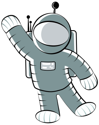
Greetings, welcome screens, empty states, "say hello" moments.
Avoid: Do not mix these line drawings with the flat gold Floaty on one graphic.

Point at a call to action or the next step.
Avoid: Do not mix these line drawings with the flat gold Floaty on one graphic.

Success messages, launches, celebrations.
Avoid: Do not mix these line drawings with the flat gold Floaty on one graphic.

Welcome, "everything included", big announcements.
Avoid: Do not mix these line drawings with the flat gold Floaty on one graphic.
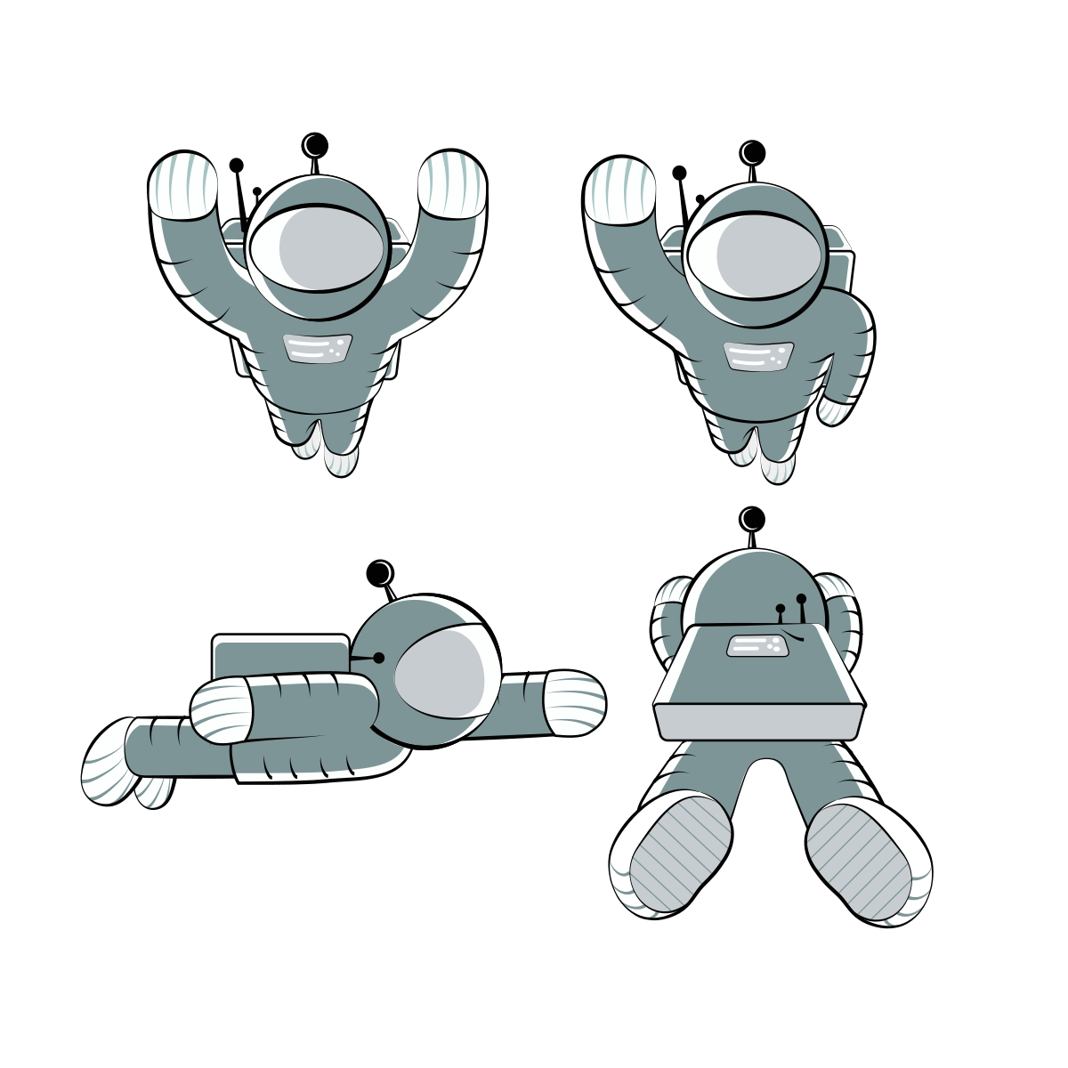
Several versions of one pose on one artboard. Crop out the one you need.
Avoid: Do not mix these line drawings with the flat gold Floaty on one graphic.
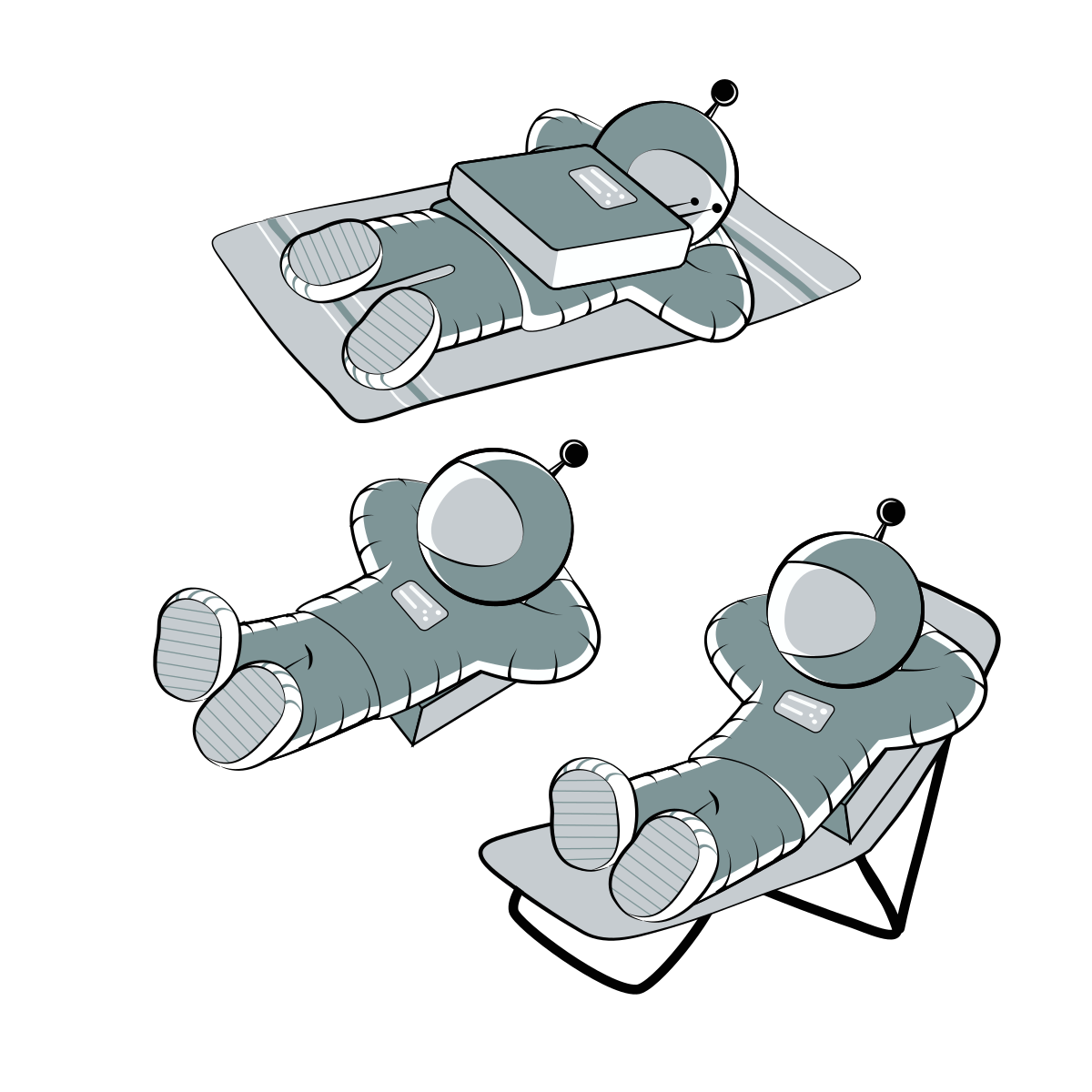
Several versions of one pose on one artboard. Crop out the one you need.
Avoid: Do not mix these line drawings with the flat gold Floaty on one graphic.
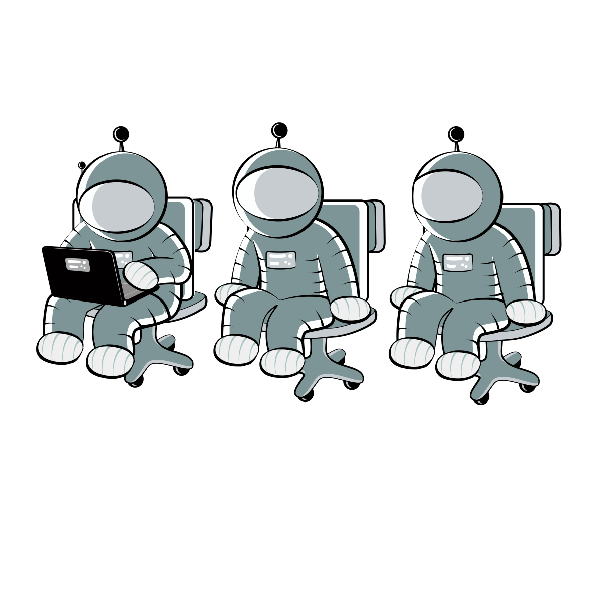
Several versions of one pose on one artboard. Crop out the one you need.
Avoid: Do not mix these line drawings with the flat gold Floaty on one graphic.
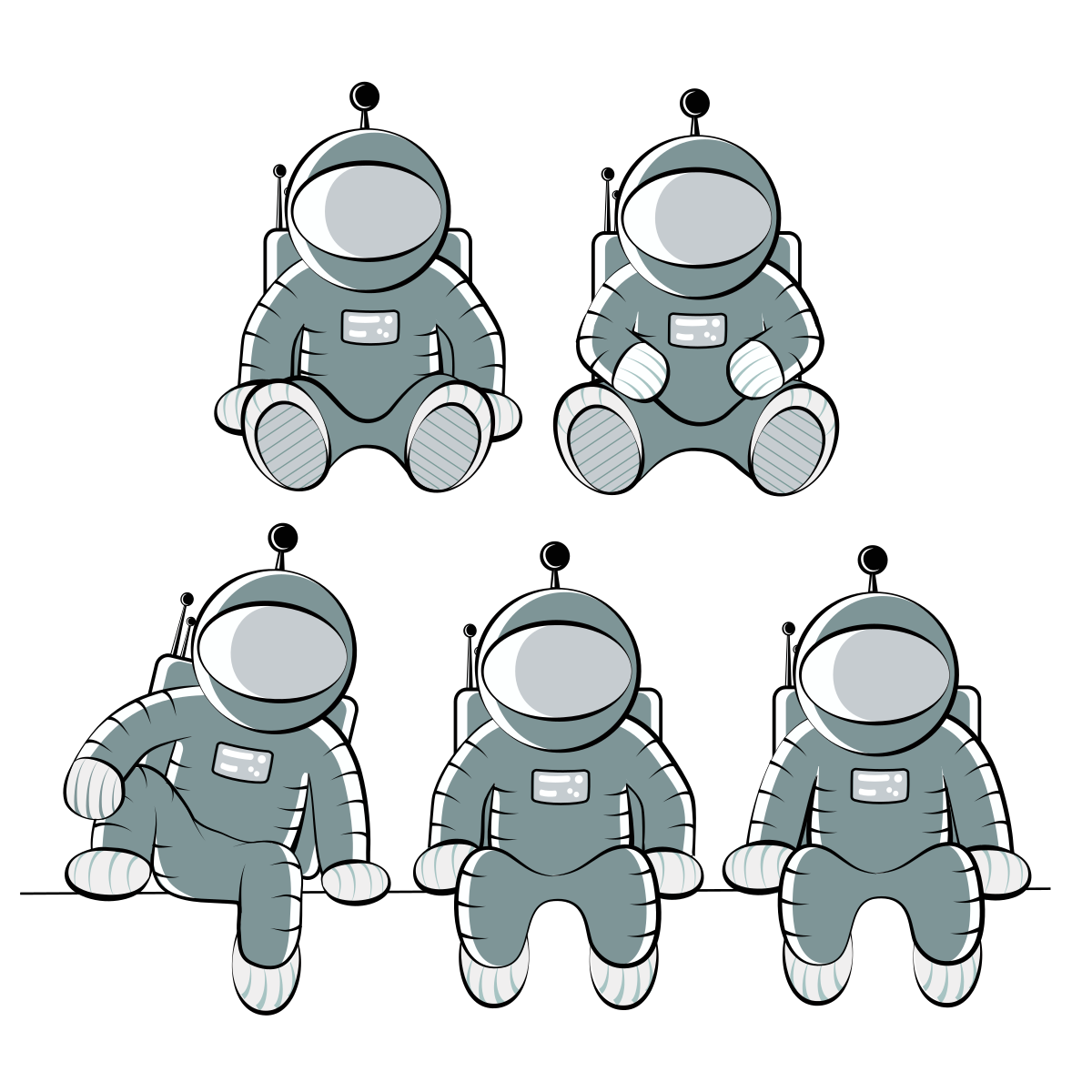
Several versions of one pose on one artboard. Crop out the one you need.
Avoid: Do not mix these line drawings with the flat gold Floaty on one graphic.
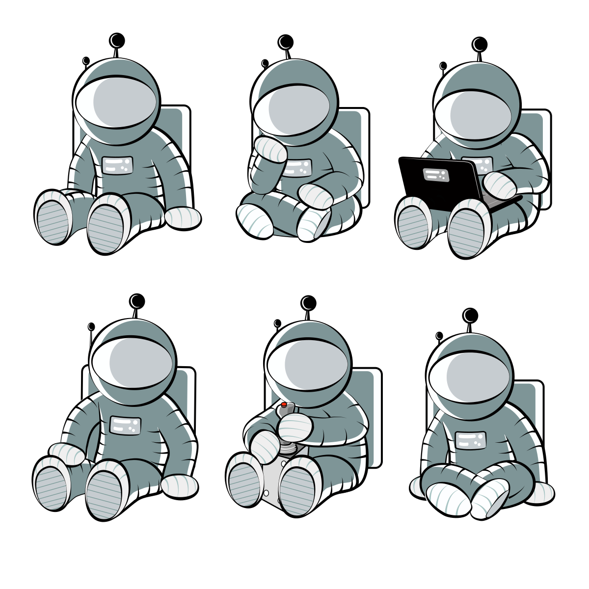
Several versions of one pose on one artboard. Crop out the one you need.
Avoid: Do not mix these line drawings with the flat gold Floaty on one graphic.
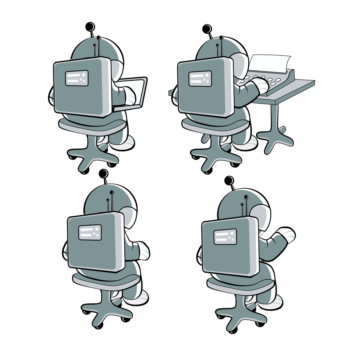
Several versions of one pose on one artboard. Crop out the one you need.
Avoid: Do not mix these line drawings with the flat gold Floaty on one graphic.
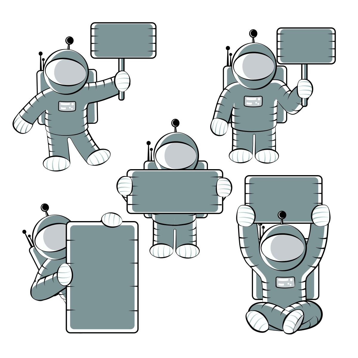
Several versions of one pose on one artboard. Crop out the one you need.
Avoid: Do not mix these line drawings with the flat gold Floaty on one graphic.
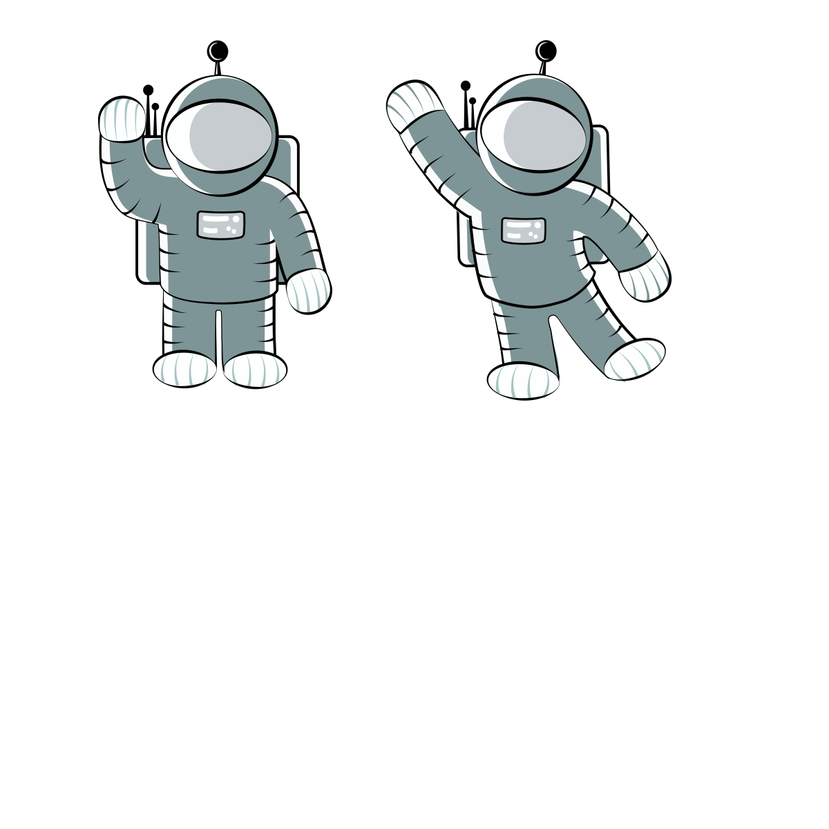
Several versions of one pose on one artboard. Crop out the one you need.
Avoid: Do not mix these line drawings with the flat gold Floaty on one graphic.
Rounded icons for lists and badges. Product icon guidelines.

GravityView product icon: a rounded square in the product color. Product lists, badges, comparison tables.

GravityEdit product icon: a rounded square in the product color. Product lists, badges, comparison tables.

GravityImport product icon: a rounded square in the product color. Product lists, badges, comparison tables.

GravityExport product icon: a rounded square in the product color. Product lists, badges, comparison tables.

GravityExport Lite product icon: a rounded square in the product color. Product lists, badges, comparison tables.

GravityCharts product icon: a rounded square in the product color. Product lists, badges, comparison tables.

GravityCalendar product icon: a rounded square in the product color. Product lists, badges, comparison tables.

GravityMath product icon: a rounded square in the product color. Product lists, badges, comparison tables.

GravityRevisions product icon: a rounded square in the product color. Product lists, badges, comparison tables.

GravityActions product icon: a rounded square in the product color. Product lists, badges, comparison tables.

GravityBoard product icon: a rounded square in the product color. Product lists, badges, comparison tables.

GravityMigrate product icon: a rounded square in the product color. Product lists, badges, comparison tables.

GravitySearch product icon: a rounded square in the product color. Product lists, badges, comparison tables.
Navy line icons for add-ons and View layouts.

Magic Links add-on or layout icon: navy line art on a white rounded square.

Elementor Widget add-on or layout icon: navy line art on a white rounded square.


Event Field add-on or layout icon: navy line art on a white rounded square.


Advanced Filtering add-on or layout icon: navy line art on a white rounded square.

Social Sharing add-on or layout icon: navy line art on a white rounded square.

A-Z Filters add-on or layout icon: navy line art on a white rounded square.

Featured Entries add-on or layout icon: navy line art on a white rounded square.

Ratings & Reviews add-on or layout icon: navy line art on a white rounded square.

Multiple Forms add-on or layout icon: navy line art on a white rounded square.

DataTables Layout add-on or layout icon: navy line art on a white rounded square.

Maps Layout add-on or layout icon: navy line art on a white rounded square.

Large gradient squares, for showing one product big.
Large full-bleed gradient square for GravityView. Use when one product is shown big: featured images, app-store style tiles.
Large full-bleed gradient square for GravityEdit. Use when one product is shown big: featured images, app-store style tiles.
Large full-bleed gradient square for GravityImport. Use when one product is shown big: featured images, app-store style tiles.
Large full-bleed gradient square for GravityExport. Use when one product is shown big: featured images, app-store style tiles.
Large full-bleed gradient square for GravityCharts. Use when one product is shown big: featured images, app-store style tiles.

Large full-bleed gradient square for GravityCalendar. Use when one product is shown big: featured images, app-store style tiles.
Large full-bleed gradient square for GravityMath. Use when one product is shown big: featured images, app-store style tiles.
Large full-bleed gradient square for GravityRevisions. Use when one product is shown big: featured images, app-store style tiles.
Large full-bleed gradient square for GravityActions. Use when one product is shown big: featured images, app-store style tiles.
Large full-bleed gradient square for GravityKit collection. Use when one product is shown big: featured images, app-store style tiles.
Navy and gold are the main brand colors. Secondary colors are for accents and charts. Click a color to copy it. Color guidelines.
Gold gradient · linear-gradient(60deg, #401500 0%, #D99B21 50%, #FFF8A6 100%) · Hero areas and emphasis. Linear at 60 degrees, 200% scale. New campaign colors come from between navy and gold.
Eudoxus Sans for headings. Lato for body text. Typography guidelines.
Brand typeface for titles and headings. Also use for body text until Lato is bundled.
Short rules for using the GravityKit name, logo and mascot.
Everything on this page is listed in brand.json, with full URLs and notes on when to use each file (use, avoid, background). Start with llms.txt. Guidelines are also available as Markdown, for example /guidelines/logo.md. Files can be fetched directly from any origin.